dScribe AI
Landing Page Redesign
Sept - Oct 2025
Designing for ROI-focused buyers in traditional industries skeptical of new technology

Overview
dScribe AI is a Y Combinator-backed startup that helps agriculture, mining, and construction companies measure stockpile inventory using drone technology and AI. This was a design challenge from 10K Designers to redesign landing pages for recent YC-backed startups.
What did I do
My Role
UX Research & UI Design
Team
Solo Designer
Timeline
3 to 4 Weeks
What's broken and why it matters
Traditional industries lose millions to manual stockpile measurement. But convincing skeptical buyers to adopt AI solutions requires trust the current landing page wasn't building.
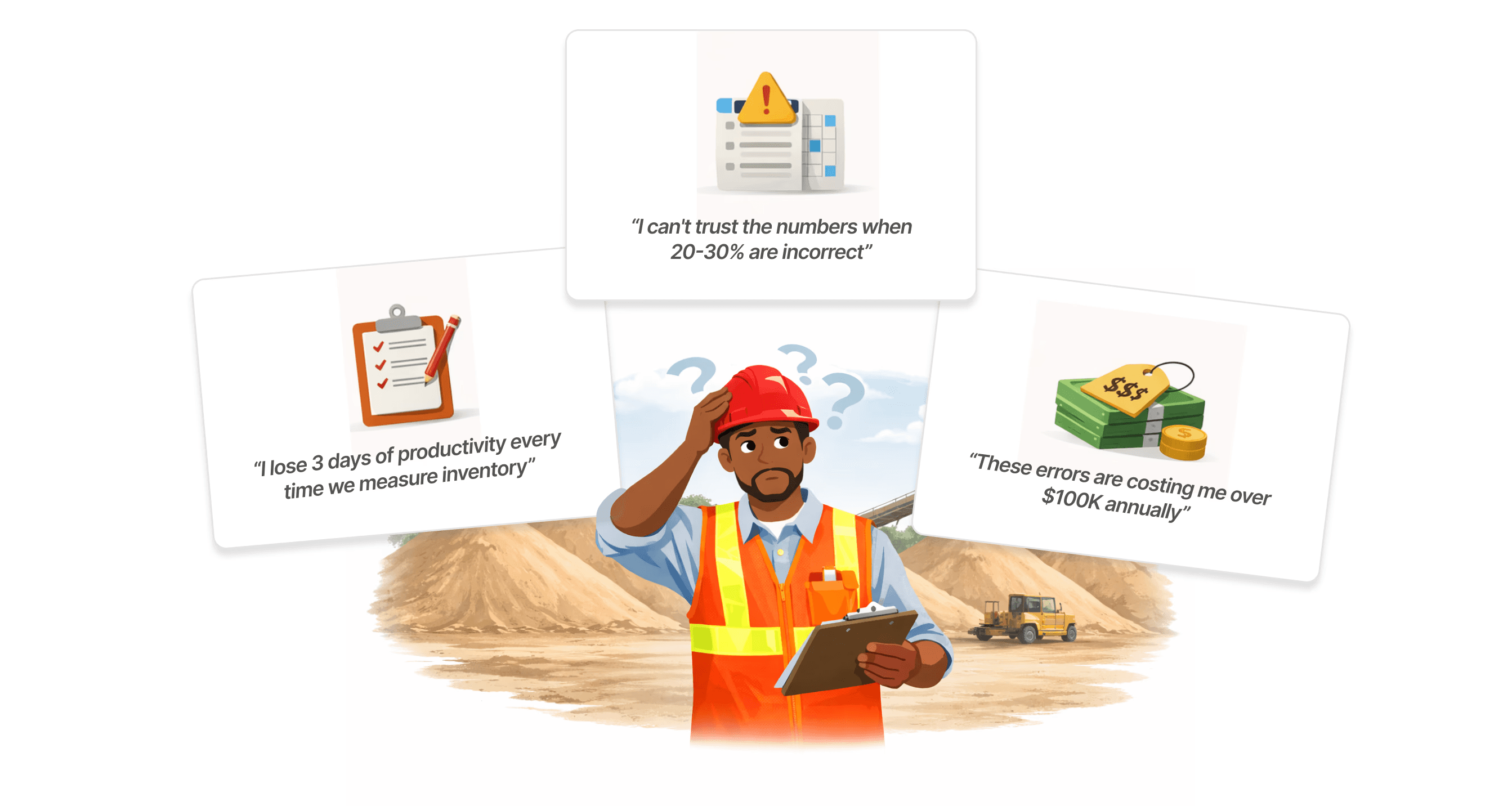
Operational Inefficiency Is Costing Millions
Manual methods are slow, inaccurate, and costly. Traditional industries are bleeding time and money on outdated stockpile measurement.
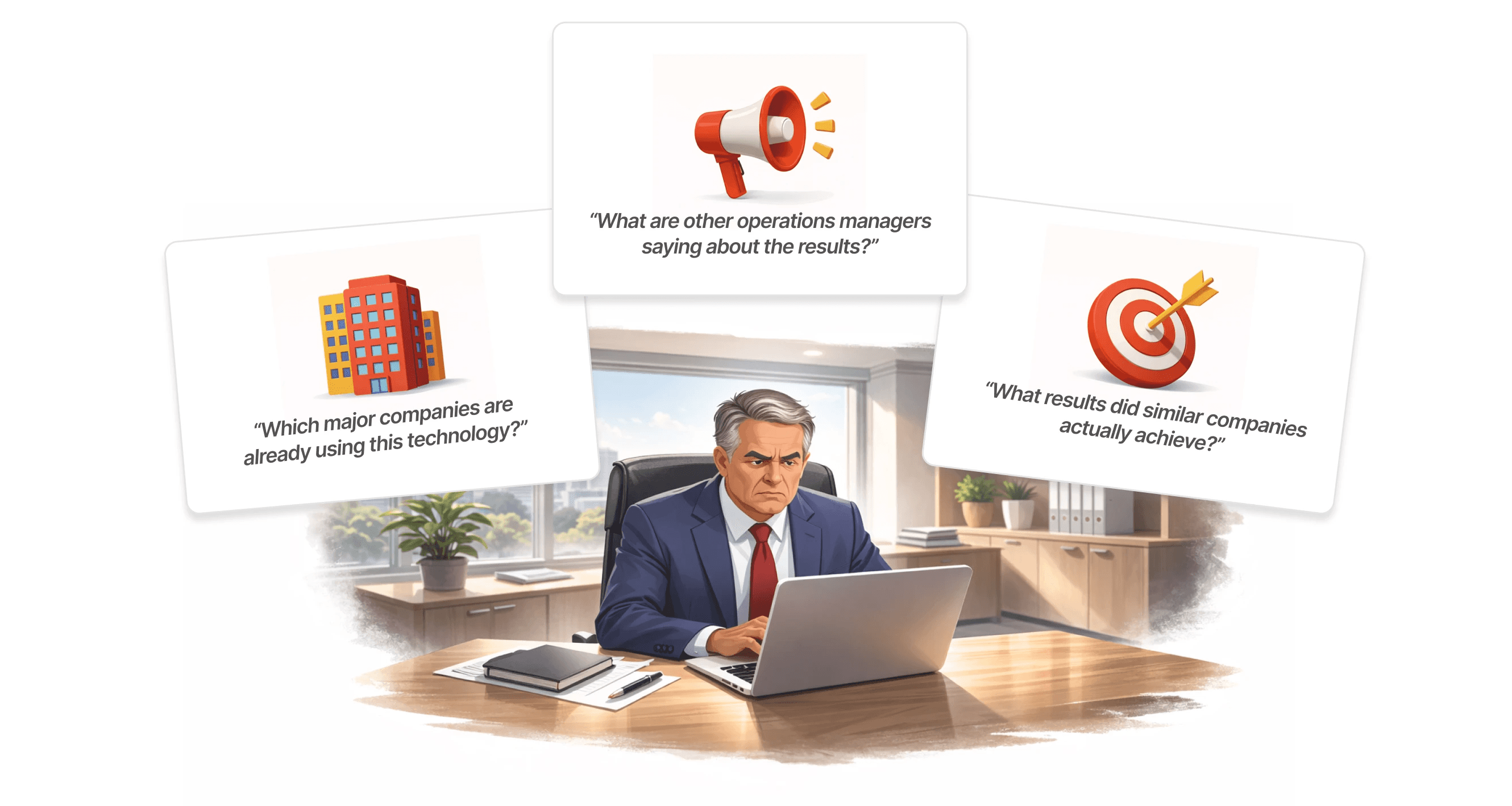
Buyers Don’t Trust New Technology
Traditional industry buyers don't invest on promises. They need evidence of value, signs of credibility, and reasons to trust before they'll even consider adopting new technology.
Problems with the current design
The page has only one section and is fundamentally broken. It fails to speak to the target audience, offers no proof of credibility, and gives skeptical buyers every reason to bounce without scheduling a demo.
Zero trust or credibility
The page lacked customer logos, testimonials, or any proof points to convince skeptical, risk-averse buyers to trust a new vendor.
No clear value proposition
Visitors couldn't quickly grasp tangible benefits or understand how the solution solved their specific operational problems.
Poor visual hierarchy
Poor visual hierarchy, basic fonts, and dark videos created a generic experience that didn't showcase drone technology properly.
The Challenge
The existing page wasn't converting anyone. Traditional buyers need more than a clean design; they need proof. Build credibility, clarity, and visual impact from scratch in thirty days.

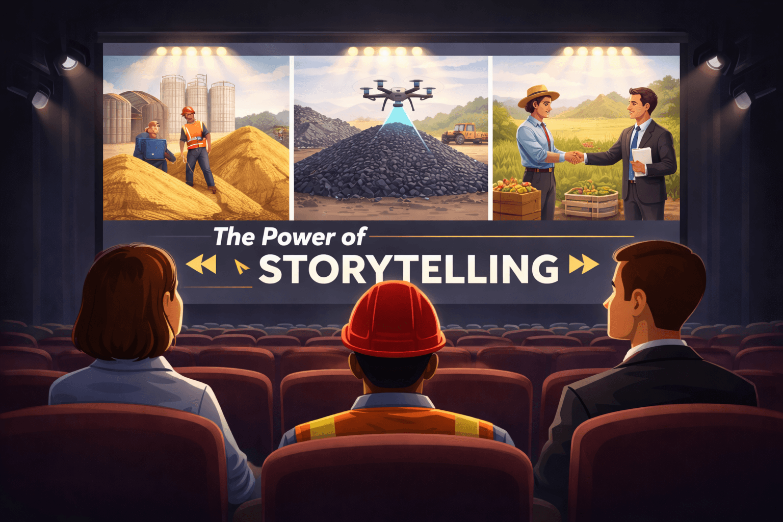
Building the Experience
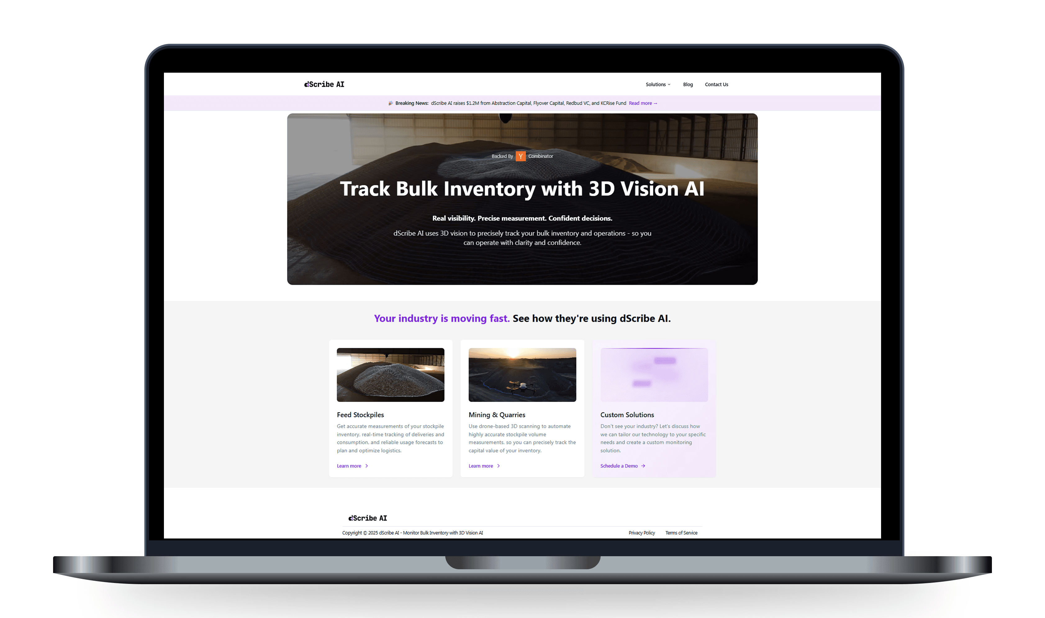
I designed the page to answer questions before they're asked. The hierarchy guides attention to what matters most. The visuals prove the technology works. Every element builds confidence as visitors move through the page.

This is a glimpse of the full design. I'd love to walk you through the complete experience on a call.
Pieces of the Whole

Each section answers a different doubt. Together they move the visitor from curious to convinced.
The Transformation

The old design told people what the product does. The new design shows them why it matters.
The decisions behind the design
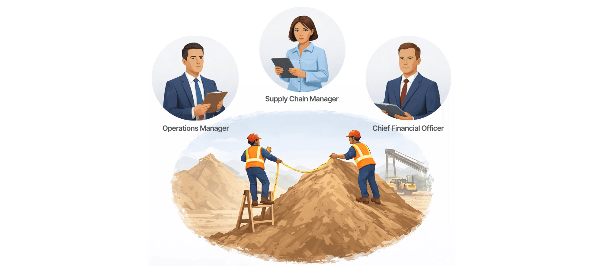
Before jumping into design, I built the foundation by understanding the product and its value deeply, identifying the users and their specific needs, and analyzing the competitive landscape thoroughly.

Despite different roles, one shared concern
Across all interviews, one priority stood out: worker safety. Manual methods put people on unstable piles at dangerous heights. The redesign needed to lead with safety benefits before discussing efficiency or ROI.

Manual measurements put safety at risk every single day
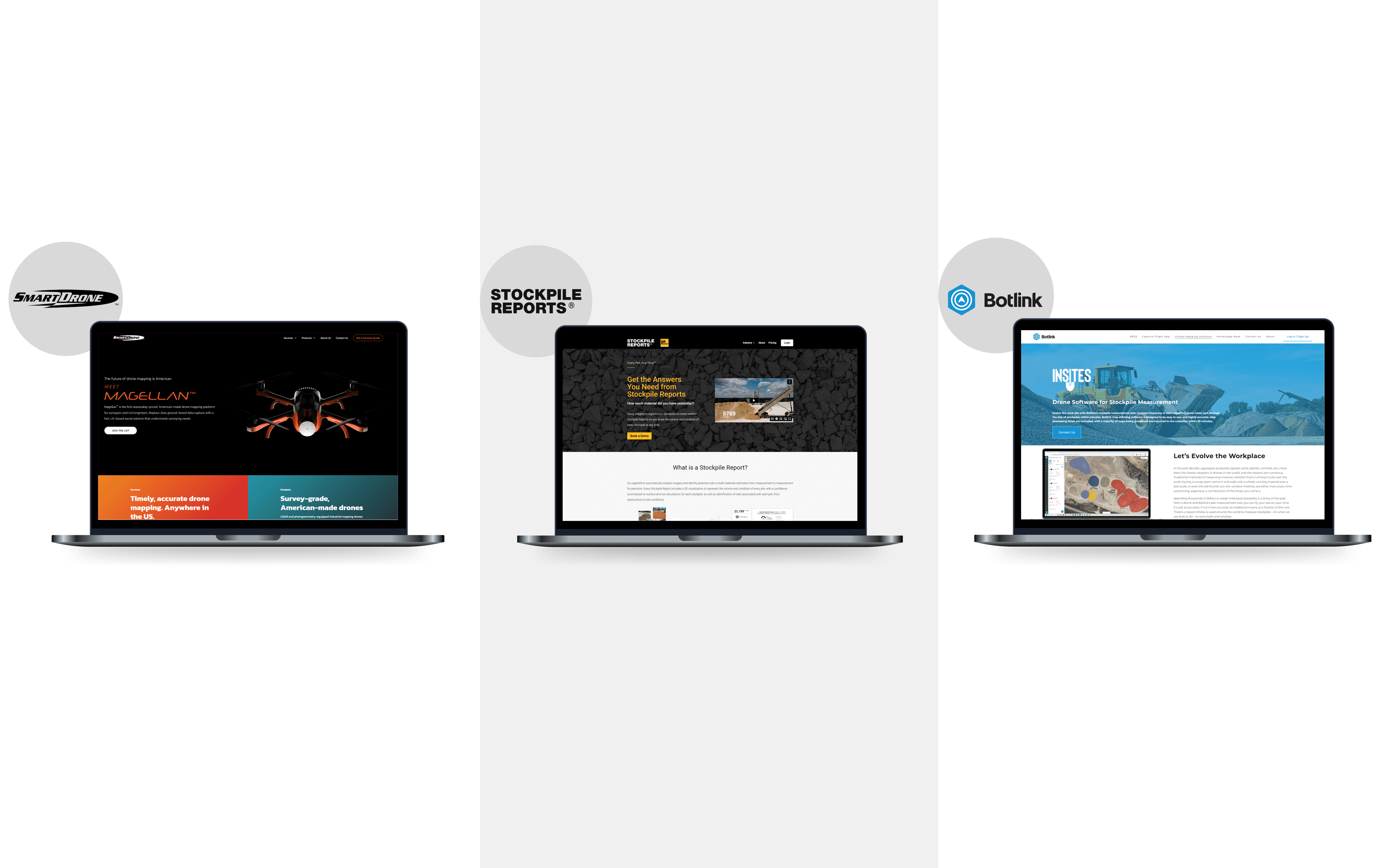
The market had a storytelling problem
Every competitor I analyzed looked professional and trustworthy on the surface. But scroll through their pages and you'd still have no idea how a drone measures a stockpile or why it matters to your business.
Structuring the story
The page works like a story. Hook with value, show the problem, demonstrate the solution, prove it works, address concerns, convert when trust is built.
How the design evolved through iterations
The first design direction missed the mark. Mentor feedback revealed fundamental issues, so I scrapped it and started fresh. The second version addressed those problems and evolved into the final solution.

The impact of the redesign
The redesign has delivered a measurable shift in user behavior. Stronger design decisions created a deep connection with the audience, with visitors spending more time, exploring further, and converting at a notably higher rate.
Bounce rate expected to decrease: A focused hero section reduces cognitive overload, giving users a clear reason to stay and explore.
CTA Click-Through Rate Expected to increase: Repositioning the CTA along the natural scroll path makes the next step feel obvious and effortless.
Average Time on Page Expected to improve: A structured layout creates a natural visual flow that pulls users deeper into the experience.
Reflections & Takeaways
Every redesign surfaces insights that go beyond the brief. Working on this project reinforced how rapidly user expectations are evolving and how industry shifts quietly shape what good design needs to deliver.
Attention spans are shrinking: Users decide within seconds whether to stay or leave, making first impressions more critical than ever.
Trust is now the entry fee: Social proof and credibility markers are no longer differentiators, users expect them before they engage.
Simplicity outperforms complexity: With content saturation at an all-time high, users respond better to focused, minimal experiences over pages that try to say everything at once.

Closing Thoughts
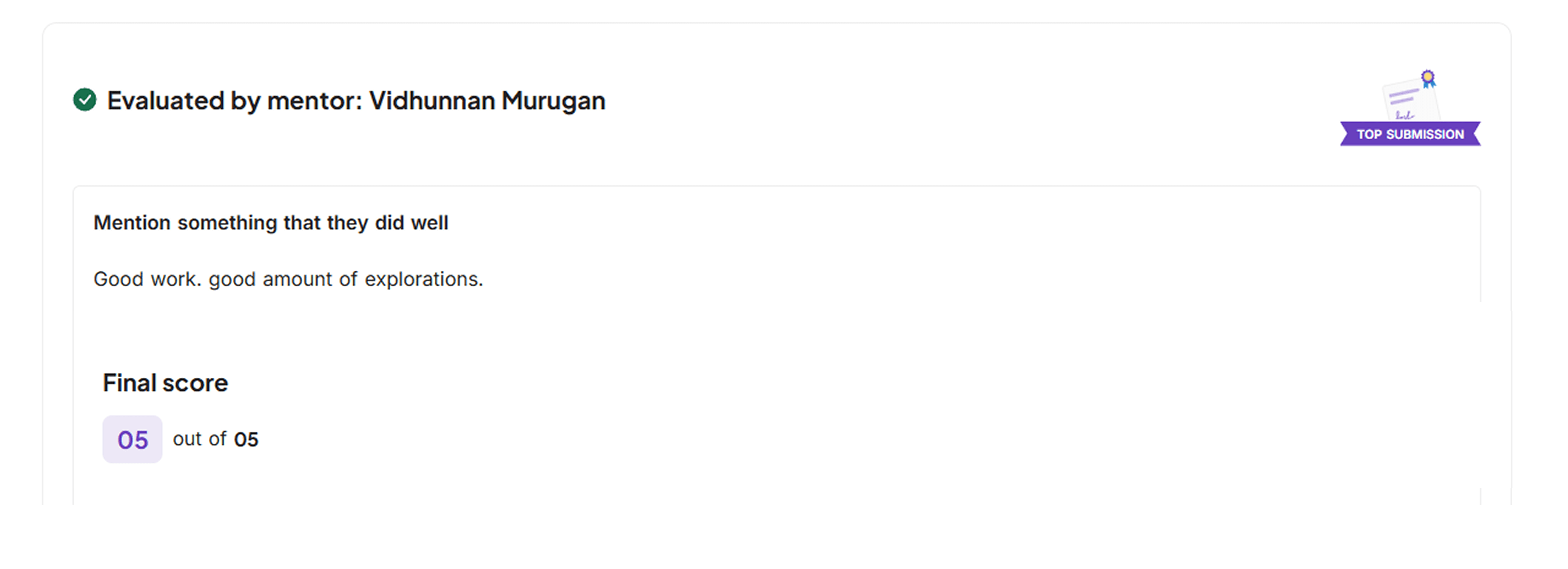
This project pushed me to design with intention, data, and real user behavior in mind and I'm thrilled it received a 5/5. Hope you liked it too! A big thank you to Abhinab, the 10K Designers community, and my mentors Priya, Yash, Vidhunnan, and Pavan for the guidance and support throughout.
dScribe AI
Landing Page Redesign
Sept - Oct 2025
Designing for ROI-focused buyers in traditional industries skeptical of new technology
Overview
dScribe AI is a Y Combinator-backed startup that helps agriculture, mining, and construction companies measure stockpile inventory using drone technology and AI. This was a design challenge from 10K Designers to redesign landing pages for recent YC-backed startups.
What did I do
My Role
UX Research & UI Design
Team
Solo Designer
Timeline
3 to 4 Weeks
What's broken and why it matters
Traditional industries lose millions to manual stockpile measurement. But convincing skeptical buyers to adopt AI solutions requires trust the current landing page wasn't building.
Operational Inefficiency Is Costing Millions
Manual methods are slow, inaccurate, and costly. Traditional industries are bleeding time and money on outdated stockpile measurement.
Buyers Don’t Trust New Technology
Traditional industry buyers don't invest on promises. They need evidence of value, signs of credibility, and reasons to trust before they'll even consider adopting new technology.
Problems with the current design
The page has only one section and is fundamentally broken. It fails to speak to the target audience, offers no proof of credibility, and gives skeptical buyers every reason to bounce without scheduling a demo.
Zero trust or credibility
The page lacked customer logos, testimonials, or any proof points to convince skeptical, risk-averse buyers to trust a new vendor.
No clear value proposition
Visitors couldn't quickly grasp tangible benefits or understand how the solution solved their specific operational problems.
Poor visual hierarchy
Poor visual hierarchy, basic fonts, and dark videos created a generic experience that didn't showcase drone technology properly.
The Challenge
The existing page wasn't converting anyone. Traditional buyers need more than a clean design; they need proof. Build credibility, clarity, and visual impact from scratch in thirty days.
Building the Experience
I designed the page to answer questions before they're asked. The hierarchy guides attention to what matters most. The visuals prove the technology works. Every element builds confidence as visitors move through the page.
This is a glimpse of the full design. I'd love to walk you through the complete experience on a call.
Other Sections
Before after design
The decisions behind the design
Before jumping into design, I built the foundation by understanding the product and its value deeply, identifying the users and their specific needs, and analyzing the competitive landscape thoroughly.
Each section answers a different doubt. Together they move the visitor from curious to convinced.
The old design told people what the product does. The new design shows them why it matters.
Despite different roles, one shared concern
Across all interviews, one priority stood out: worker safety. Manual methods put people on unstable piles at dangerous heights. The redesign needed to lead with safety benefits before discussing efficiency or ROI.
The market had a storytelling problem
Every competitor I analyzed looked professional and trustworthy on the surface. But scroll through their pages and you'd still have no idea how a drone measures a stockpile or why it matters to your business.
Structuring the story
The page works like a story. Hook with value, show the problem, demonstrate the solution, prove it works, address concerns, convert when trust is built.
Manual measurements put safety at risk every single day
How the design evolved through iterations
The first design direction missed the mark. Mentor feedback revealed fundamental issues, so I scrapped it and started fresh. The second version addressed those problems and evolved into the final solution.
The impact of the redesign
The redesign has delivered a measurable shift in user behavior. Stronger design decisions created a deep connection with the audience, with visitors spending more time, exploring further, and converting at a notably higher rate.
Bounce rate expected to decrease: A focused hero section reduces cognitive overload, giving users a clear reason to stay and explore.
CTA Click-Through Rate Expected to increase: Repositioning the CTA along the natural scroll path makes the next step feel obvious and effortless.
Average Time on Page Expected to improve: A structured layout creates a natural visual flow that pulls users deeper into the experience.
Reflections & Takeaways
Every redesign surfaces insights that go beyond the brief. Working on this project reinforced how rapidly user expectations are evolving and how industry shifts quietly shape what good design needs to deliver.
Attention spans are shrinking: Users decide within seconds whether to stay or leave, making first impressions more critical than ever.
Trust is now the entry fee: Social proof and credibility markers are no longer differentiators, users expect them before they engage.
Simplicity outperforms complexity: With content saturation at an all-time high, users respond better to focused, minimal experiences over pages that try to say everything at once.
Closing Thoughts
This project pushed me to design with intention, data, and real user behavior in mind and I'm thrilled it received a 5/5. Hope you liked it too! A big thank you to Abhinab, the 10K Designers community, and my mentors Priya, Yash, Vidhunnan, and Pavan for the guidance and support throughout.
dScribe AI
Landing Page Redesign
Sept - Oct 2025
Designing for ROI-focused buyers in traditional industries skeptical of new technology
Overview
dScribe AI is a Y Combinator-backed startup that helps agriculture, mining, and construction companies measure stockpile inventory using drone technology and AI. This was a design challenge from 10K Designers to redesign landing pages for recent YC-backed startups.
What did I do
My Role
UX Research & UI Design
Team
Solo Designer
Timeline
3 to 4 Weeks
What's broken and why it matters
Traditional industries lose millions to manual stockpile measurement. But convincing skeptical buyers to adopt AI solutions requires trust the current landing page wasn't building.
Operational Inefficiency Is Costing Millions
Manual methods are slow, inaccurate, and costly. Traditional industries are bleeding time and money on outdated stockpile measurement.

Buyers Don’t Trust New Technology
Traditional industry buyers don't invest on promises. They need evidence of value, signs of credibility, and reasons to trust before they'll even consider adopting new technology.

Problems with the current design
The page has only one section and is fundamentally broken. It fails to speak to the target audience, offers no proof of credibility, and gives skeptical buyers every reason to bounce without scheduling a demo.
Zero trust or credibility
The page lacked customer logos, testimonials, or any proof points to convince skeptical, risk-averse buyers to trust a new vendor.
No clear value proposition
Visitors couldn't quickly grasp tangible benefits or understand how the solution solved their specific operational problems.
Poor visual hierarchy
Poor visual hierarchy, basic fonts, and dark videos created a generic experience that didn't showcase drone technology properly.
The Challenge
The existing page wasn't converting anyone. Traditional buyers need more than a clean design; they need proof. Build credibility, clarity, and visual impact from scratch in thirty days.

Building the Experience
I designed the page to answer questions before they're asked. The hierarchy guides attention to what matters most. The visuals prove the technology works. Every element builds confidence as visitors move through the page.
This is a glimpse of the full design. I'd love to walk you through the complete experience on a call.
Other Sections
Before after design

The old design told people what the product does. The new design shows them why it matters.
The decisions behind the design
Before jumping into design, I built the foundation by understanding the product and its value deeply, identifying the users and their specific needs, and analyzing the competitive landscape thoroughly.
Each section answers a different doubt. Together they move the visitor from curious to convinced.
Despite different roles, one shared concern
Across all interviews, one priority stood out: worker safety. Manual methods put people on unstable piles at dangerous heights. The redesign needed to lead with safety benefits before discussing efficiency or ROI.

The market had a storytelling problem
Every competitor I analyzed looked professional and trustworthy on the surface. But scroll through their pages and you'd still have no idea how a drone measures a stockpile or why it matters to your business.
Structuring the story
The page works like a story. Hook with value, show the problem, demonstrate the solution, prove it works, address concerns, convert when trust is built.
Manual measurements put safety at risk every single day
How the design evolved through iterations
The first design direction missed the mark. Mentor feedback revealed fundamental issues, so I scrapped it and started fresh. The second version addressed those problems and evolved into the final solution.
The impact of the redesign
The redesign has delivered a measurable shift in user behavior. Stronger design decisions created a deep connection with the audience, with visitors spending more time, exploring further, and converting at a notably higher rate.
Bounce rate expected to decrease: A focused hero section reduces cognitive overload, giving users a clear reason to stay and explore.
CTA Click-Through Rate Expected to increase: Repositioning the CTA along the natural scroll path makes the next step feel obvious and effortless.
Average Time on Page Expected to improve: A structured layout creates a natural visual flow that pulls users deeper into the experience.
Reflections & Takeaways
Every redesign surfaces insights that go beyond the brief. Working on this project reinforced how rapidly user expectations are evolving and how industry shifts quietly shape what good design needs to deliver.
Attention spans are shrinking: Users decide within seconds whether to stay or leave, making first impressions more critical than ever.
Trust is now the entry fee: Social proof and credibility markers are no longer differentiators, users expect them before they engage.
Simplicity outperforms complexity: With content saturation at an all-time high, users respond better to focused, minimal experiences over pages that try to say everything at once.
Closing Thoughts
This project pushed me to design with intention, data, and real user behavior in mind and I'm thrilled it received a 5/5. Hope you liked it too! A big thank you to Abhinab, the 10K Designers community, and my mentors Priya, Yash, Vidhunnan, and Pavan for the guidance and support throughout.